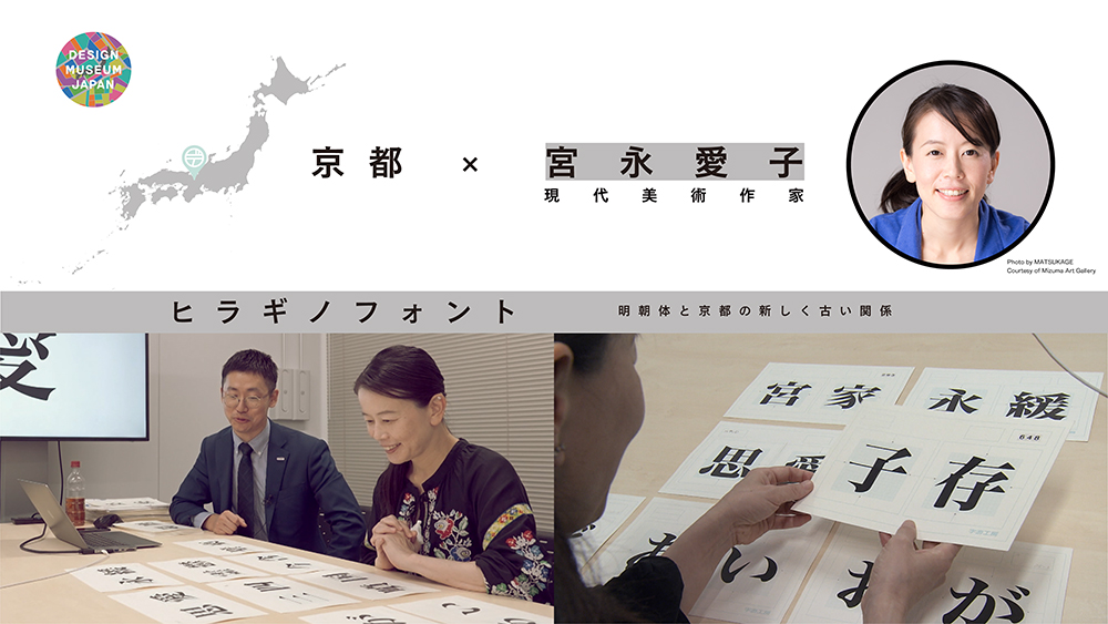
The Hiragino fonts were developed by a printing device manufacturer in 1993 just as desktop printing (DTP) direct from personal computer data was spreading in Japan and in response to calls from designers and platemaking and printing companies for a versatile, high-quality font. These days, almost all font development is performed digitally but the Mincho font, the first in the Hiragino series, was hand-drawn. The time devoted to the many corrections and revisions remains etched in its forms.
Now widely familiar, the Mincho font was born in Kyoto and the base forms of its characters were deeply rooted in the place of their birth.
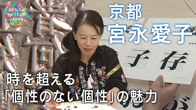
Aiko Miyanaga Contemporary artist
Kyoto, Kyoto Prefecture
the Hiragino fonts
Aiko Miyanaga researches the Hiragino fonts of Kyoto. She considers the birth and dissemination across time of these fonts we now take for granted.
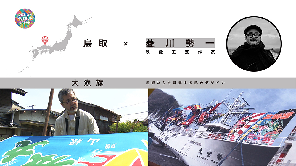
DESIGN TREASURE
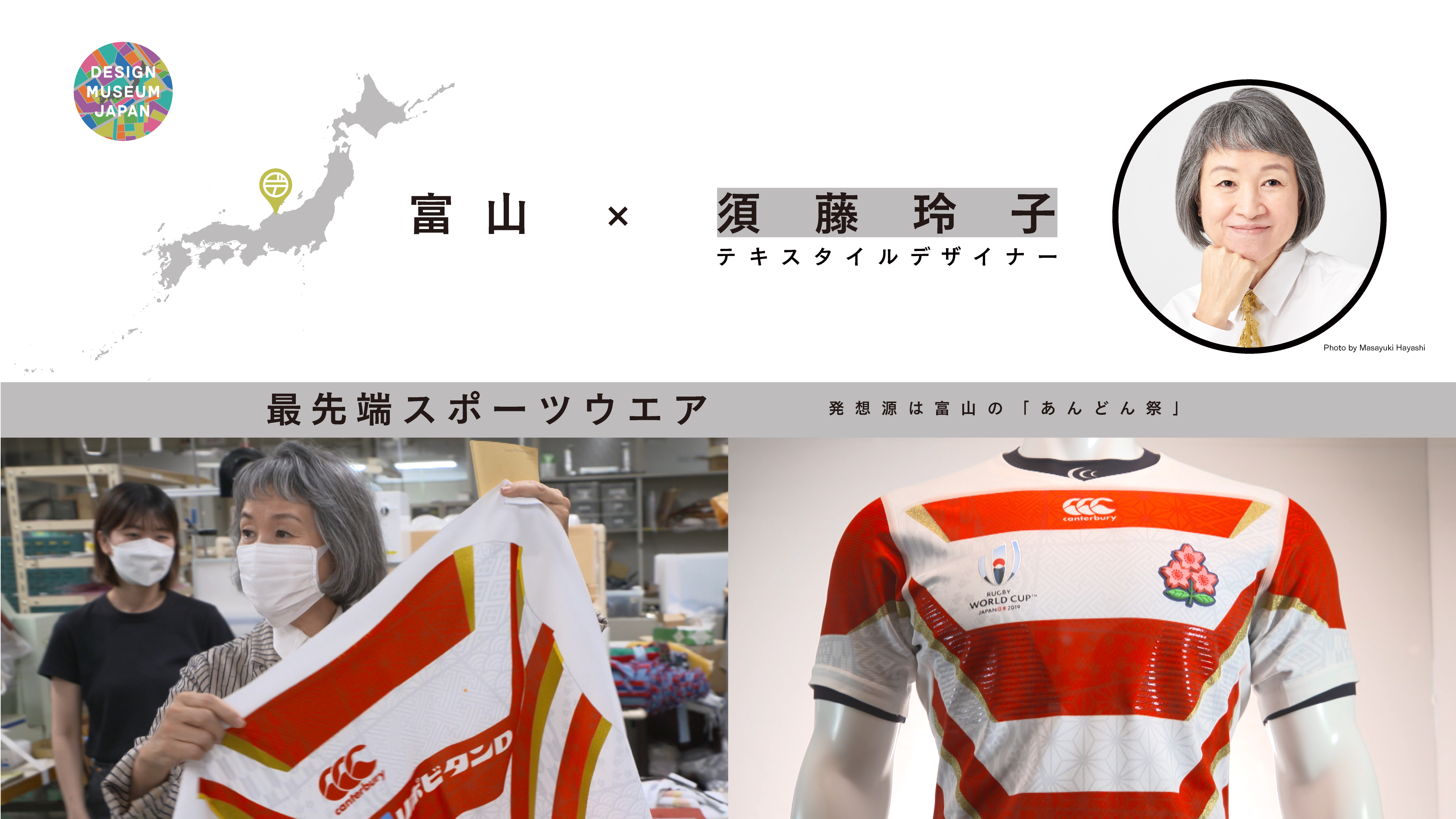
The Mincho Font of Kyoto Old and New
Characters of the Hiragino Mincho font
CREATOR

Photo:MATSUKAGE
Courtesy of Mizuma Art Gallery
Aiko Miyanaga Contemporary artist
Born in Kyoto in 1974
From everyday objects shaped from naphthalene to installations of salt, penetrating ceramic sounds and leaf veins, Miyanaga is widely acclaimed for her use of time’s traces to express continuity in a changing world.
Recent solo exhibitions include Aiko Miyanaga: Wrapping Poetry (2023) at the Toyama Glass Art Museum and Aiko Miyanaga: Reading the Sea (2023) at Zenbi, the Kagizen Art Museum in Kyoto. She also participated in the group exhibition, World Classroom: Contemporary Art through School Subjects (2023), at the Mori Art Museum.
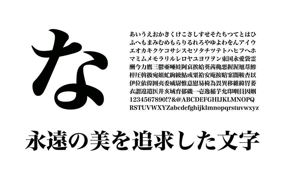
The Hiragino Mincho font
Photo: SCREEN Holdings
Roots of the Mincho font
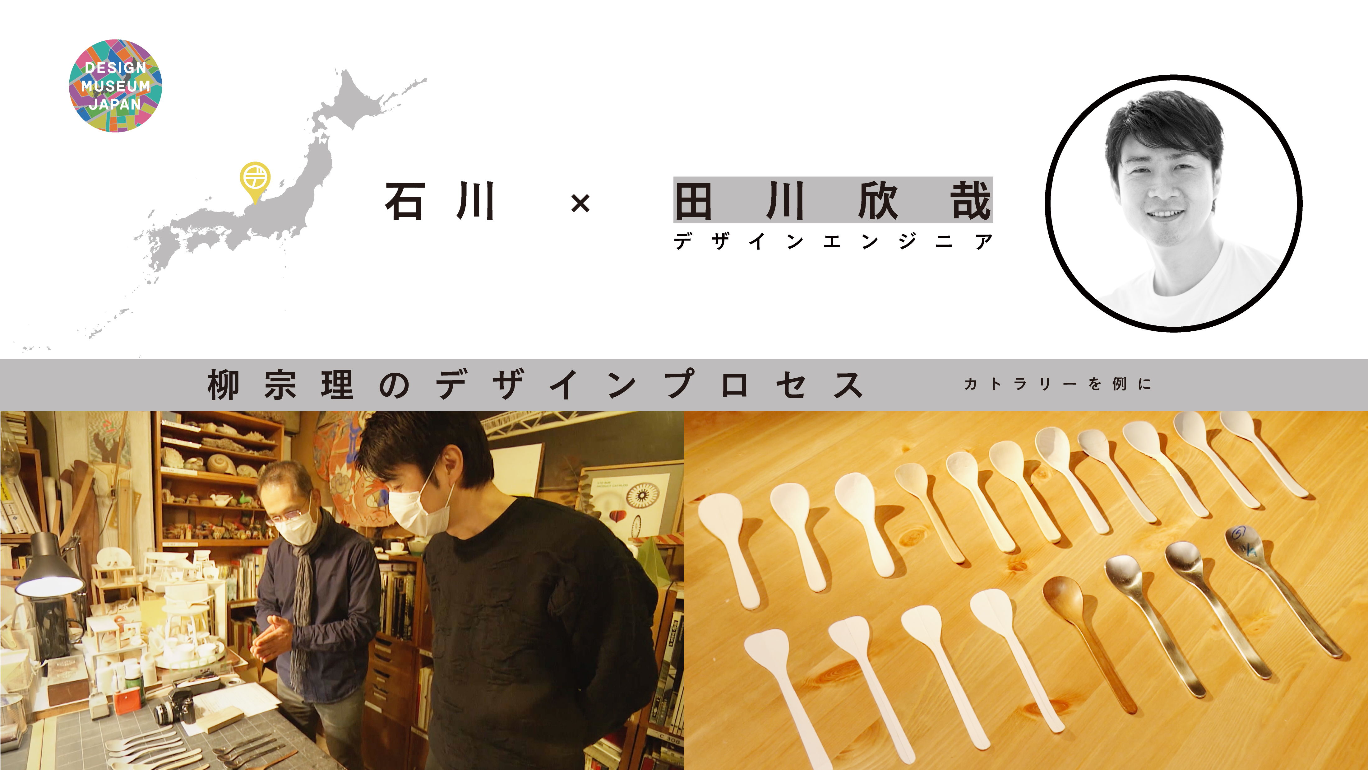
The Hiragino fonts come in a number of standard types, of which the Mincho font is the most familiar to Japanese people. The character shapes and line thicknesses are reminiscent of brush strokes and their varying emphasis makes for high readability. The Mincho font is said to be descended from the woodblock prints of sutras* prepared by a Zen master, Tetsugen, and kept at the Hozoin temple in Kyoto. Viewing the roughly 60,000 woodblocks, Miyanaga senses “how this huge project was only possible because of total dedication to the spread of Buddhism.”
*A compendium of Buddhist texts translated into Chinese by Xuanzang and others
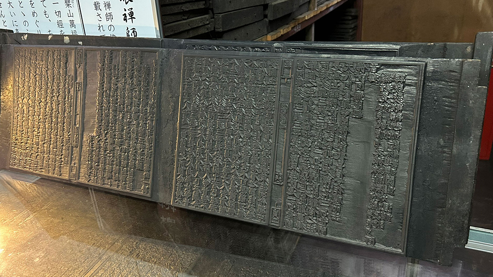
Tetsugen woodblocks
Photo: Hozoin
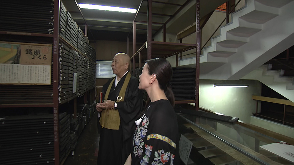
Miyanaga views the woodblock repository
Neutral but distinctive
With the advance of digital design and production, as people searched for a high-quality font suitable for use by everyone, the Hiragino fonts were devised to sit in harmony with photographs on the magazine page and yet also stand out. The original concept of a unique, cool, contemporary design has withstood the test of time and the fonts still feel fresh today more that 30 years on. The Hiragino fonts were created to be neutral with no extreme features. Miyanaga says, “It is not that these characters have lost their individuality, but rather that their non-individuality makes them unique.”
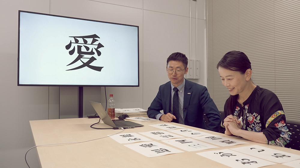
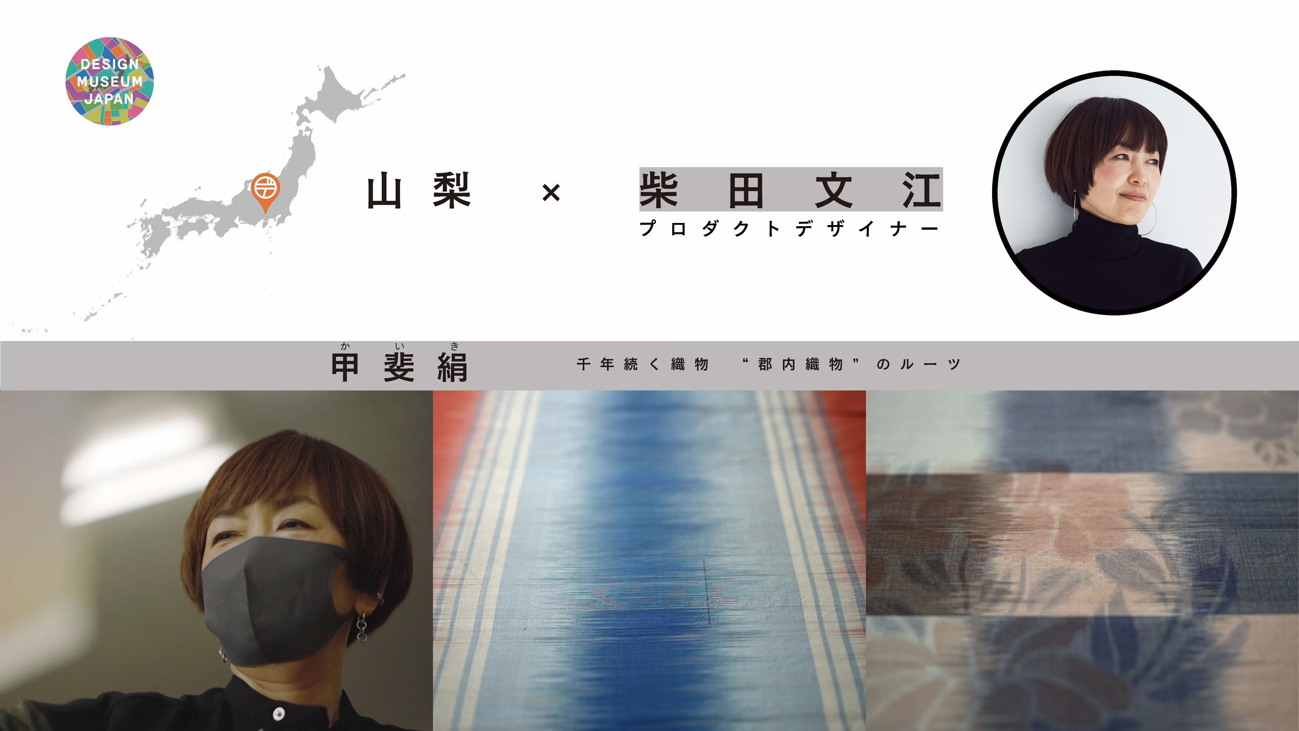
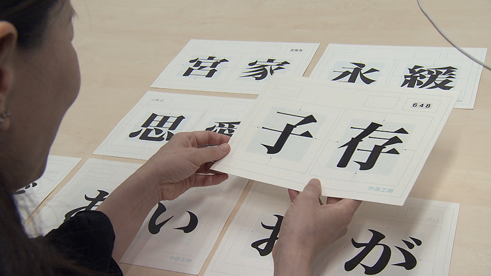
Miyanaga examines the script.
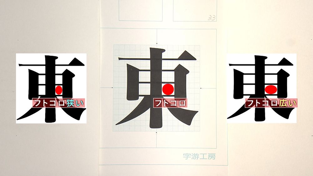
Design secrets of the Hiragino fonts
1.Big characters*
The characters of the Hiragino fonts are made on the large side. Sufficient space is then maintained between them for relaxing readability.
*Each character is designed separately in its own square. The size is relative to the size of the square.
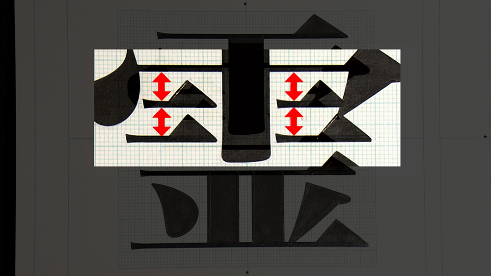
2.Moderate gaps* between the lines
The gaps within each character are neither to narrow nor too wide. They are set to be middling for optimal readability. Too narrow, and they would blur at low resolutions. Too wide, and the characters would be too square, making them hard to tell apart.
*The blank spaces inside the characters
3.The center of gravity in the middle
Each character’s center of gravity is set neither too high nor too low but rather in the center of the visual field for easy reading both vertically and horizontally. Too high, and it would feel too sprightly. Too low, and it would feel too staid.
4.Balanced script density
The spaces are set and line densities adjusted to eliminate extremes. The resulting sentences look balanced to the eye and are also easy to read.
Information from SCREEN Holdings
Global diffusion from Japan
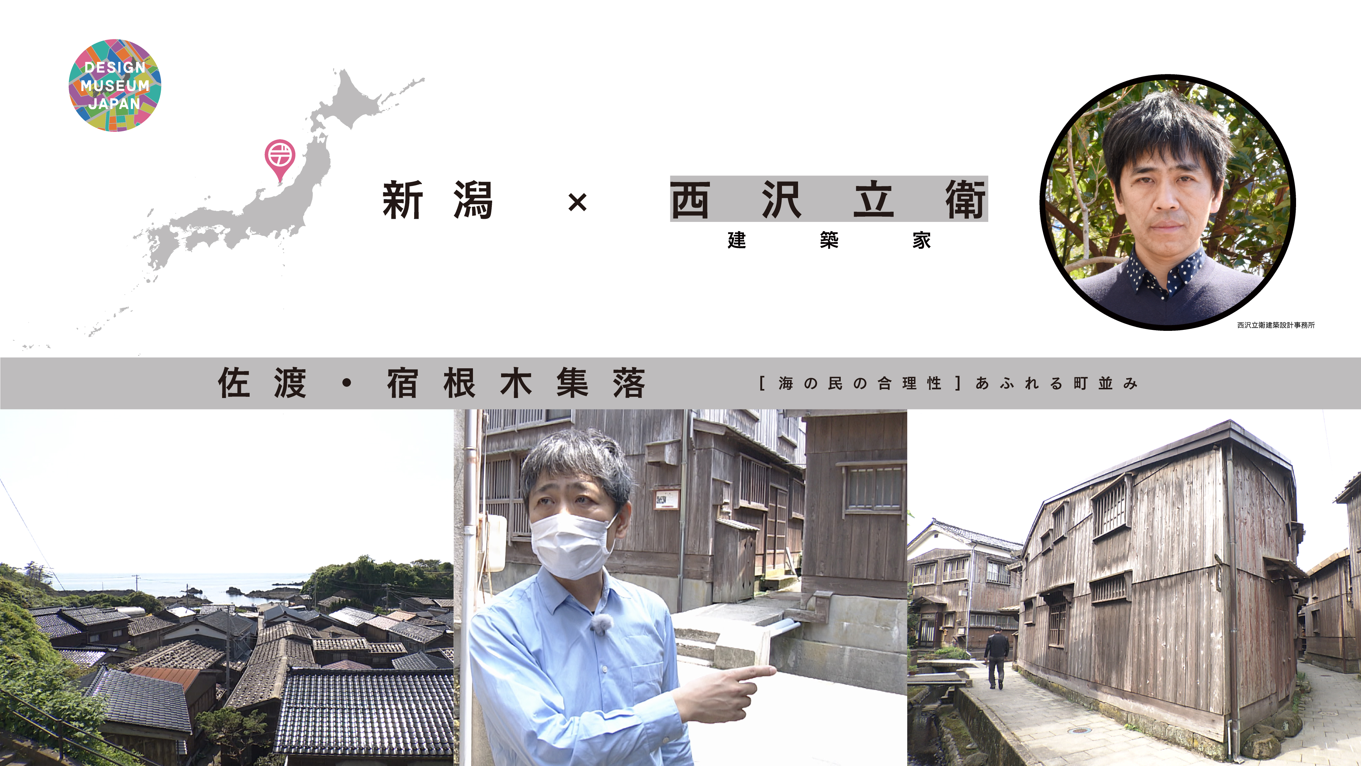
From expressway road signs to magazines and packages, the Hiragino fonts have found many uses. In 2000, Steve Jobs announced Apple’s adoption of Hiragino for its MacOS system, making the name, Hiragino, familiar to users worldwide. Apple has already been using Hiragino for the Japanese script in its products for over 20 years. It is now established as an everyday global norm. Having learned the story of these ubiquitous characters, Miyanaga says she has realized again how “the imagining of one new beginning can become a beginning for many things.”
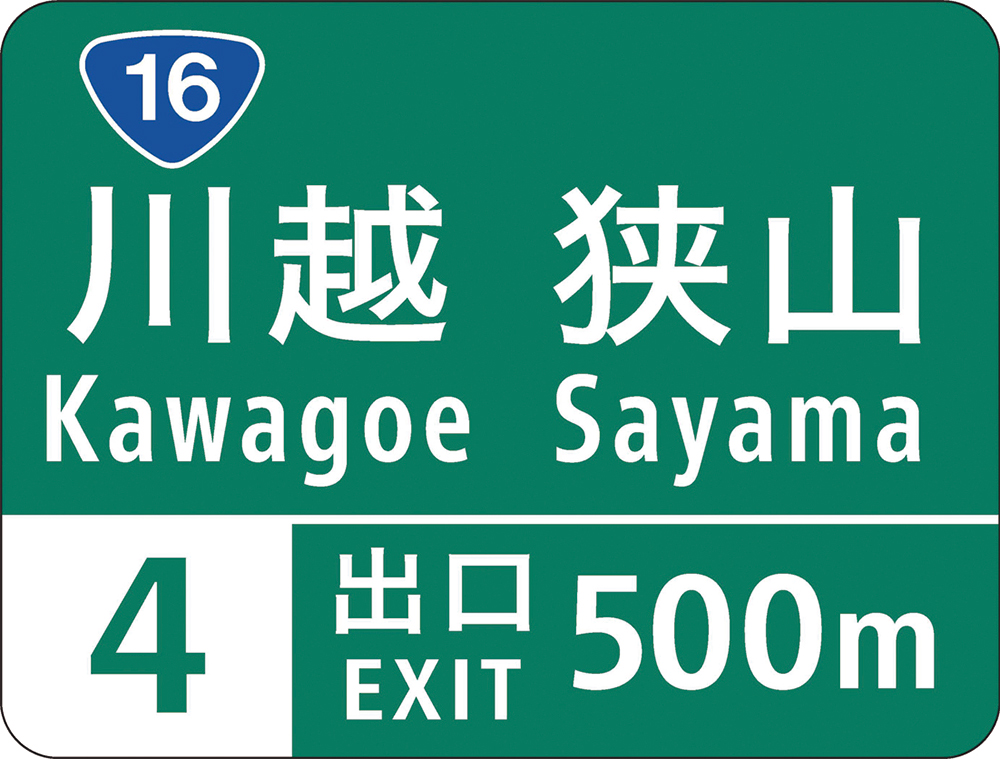
The Hiragino font for the Japanese characters on an expressway road sign is easy to read from afar.
Photo: NEXCO EAST
Where can you find this design treasure?
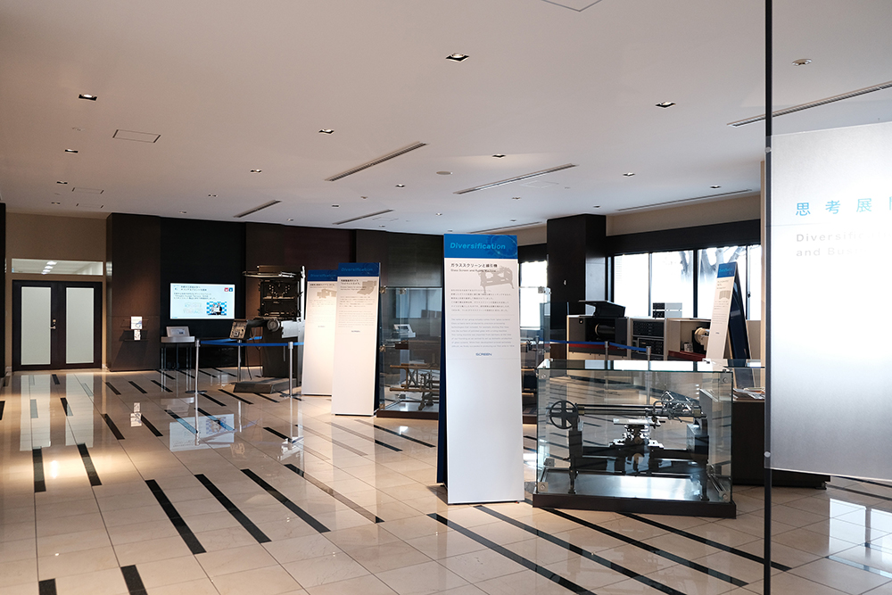
SCREEN Shiko Tenkai Gallery
Shiko Tenkai (Thought Development) is the spirit of considering how our company can apply its technologies to helping society and then creating and developing the new operations and products that will do so. The SCREEN Shiko Tenkai Gallery introduces technologies and products of each era that have supported the progress made so far.
SCREEN Holdings Headquarters,
Tenjinkita-machi 1-1
4 Horikawa-dori Teranouchi Agaru
Kamigyo-ku Kyoto-shi 602-8585
Please check the website for details of use.